Basic Git
git add . git status git commit -m “message”
remote repo git clone git@github..xyz.git git push git push git push origin main
program | action | Destination
HTML basics
TEXT

<h1>,<h2>,...<h6>,<p>
<b> <strong>
<i> <em>
<mark> //highlight something
<del>
<ins> //inserted text
<sub>
<sup>

LIST

<ol start="4" type="a" reversed> //use css instead of type
<ul type=" ">
<li>

Anchor

<a href="URL" target="_self"> </a>  //target : _self,_blank,_top,_parent
URL
absolute : protocol://domain/path   eg. https://www.google.com/help
relative : if same folder than just about.html
			else ./path/about.html
			../ go to parent directory


IMAGE
<img src=" " alt=" " height=" " width=" ">
CSS Basics
.Selector{
Property : value
}

eg...

div.bold-text{
font-weight:400
}

Selectors

	Universal Selector
	   eg.
	   *{
	   color:purple
	    }
	Type Selector
		div{
		color : pink
		}
	class selector
		.classname{
		color:white
		}
	id selector
		#idname {
			color : blue
			}


selector could be grouped

.class , #id{
	properties..
}

.class{
	seperate properties extras
}

#id{
	seperate properties
}


Selector can be chained


Two classes
.subsection.header{


}

Class&ID

.subsection#money{


}

		IN General we cant chain more than one type of selector


COMBINATORS

The **descendant combinator** — typically represented by a single space (" ") character — combines two selectors such that elements matched by the second selector are selected if they have an ancestor (parent, parent's parent, parent's parent's parent, etc.) element matching the first selector.

.box div{}

The **child combinator** (`>`) is placed between two CSS selectors. It matches only those elements matched by the second selector that are the direct children of elements matched by the first. Descendant elements further down the hierarchy don't match

article > p {}


The adjacent sibling selector (`+`) is placed between two CSS selectors. It matches only those elements matched by the second selector that are the next sibling element of the first selector. For example, to select all `<img>` elements that are immediately preceded by a `<p>` element:

p + img {}

If you want to select siblings of an element even if they are not directly adjacent, then you can use the general sibling combinator (`~`). To select all `<img>` elements that come _anywhere_ after `<p>` elements

p ~ img {}


#element{
color:red;
background-color:green;
font-family:xyz;
font-size:31px;
font-weight:400;
text-align:center;
property: value !important;
}

When a declaration is important, the order of precedence is reversed. Declarations marked as important in the user-agent style sheets override all important declarations in the user style sheets.


1. Specifity
	Inline>ID selector>Class Selector>Type selector
2. INHERITANCE
	some properties are automatically inherited like color
	but we can manualy inherit by using inherit in css
			p {
		  border: medium solid;
		}

		em {
		  border: inherit;
		}
3. Rule Order
	last defined rule if everything else conflicts


.box{
	width:100px;
	height:200px;
	margin:30px;
	padding:10px;
	border:20px;
	box-sizing:border-box;
	display:block; //block,inline,inline-block,flex,grid

}

margin collapse only in vertical margin
The top and bottom margins of blocks are sometimes combined (collapsed) into a single margin whose size is the largest of the individual margins (or just one of them, if they are equal), a behavior known as margin collapsing. Note that the margins of floating and absolutely positioned elements never collapse.


use <div> for making a block
and <span> for making a inline element


https://css-tricks.com/snippets/css/a-guide-to-flexbox/
Others//Random
HTML: To display a less than sign (<) we must write: < or <
If you write 10 spaces in your text, the browser will remove 9 of them. To add real spaces to your text, you can use the character entity.
CSS: overflow : x,y white-space : pre https://developer.mozilla.org/en-US/docs/Web/CSS/white-space
float : left,right,note
flex-flow : direction wrap
.container { display: flex; … gap: 10px; gap: 10px 20px; /* row-gap column gap */ row-gap: 10px; column-gap: 20px; }
.item { order: 5; /* default is 0 */ }
.item { flex: none | [ <‘flex-grow’> <‘flex-shrink’>? || <‘flex-basis’> ] }
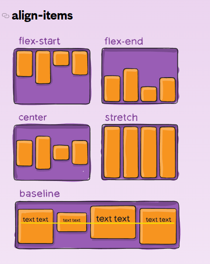
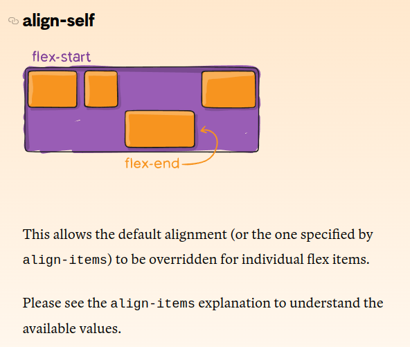 .item {
align-self: auto | flex-start | flex-end | center | baseline | stretch;
}
.item {
align-self: auto | flex-start | flex-end | center | baseline | stretch;
}