transition property, which is actually a shorthand property for transition-property, transition-duration, transition-timing-function and transition-delay.
div {
  transition: <property> <duration> <timing-function> <delay>;
}
button {
/* ... other CSS properties ... */
transition-property: background-color;
transition-duration: 1s;
transition-timing-function: ease-out;
transition-delay: 0.25s;
}-
transition-property- This determines what CSS property will be transitioned. In this case it is thebackground-color. -
transition-duration- This determines the duration that the transition will occur over. In this case the color change will gradually happen over 1 second. -
transition-timing-function- This lets us change the speed of the transition over the course of its duration. Here it willease-out, meaning the color change will be faster at the start than at the end of the transition. -
transition-delay- This determines the delay at which the transition will start. In this case, the color change starts a quarter of a second after the cursor rests on the button.
shorthand:
button {
  /* ... other CSS properties ... */
  background-color: white;
  transition: background-color 1s ease-out 0.25s;
}

button:hover {
  background-color: black;
}
multiple transitions
  transition:
    width 2s,
    height 2s,
    background-color 2s,
    rotate 2s;
transition and JS
transition event : https://developer.mozilla.org/en-US/docs/Web/API/TransitionEvent
Detecting the start and completion of a transition
You can use the transitionend event to detect that an animation has finished running. This is a TransitionEvent object, which has two added properties beyond a typical Event object:
propertyName
A string indicating the name of the CSS property whose transition completed.
elapsedTime
A float indicating the number of seconds the transition had been running at the time the event fired. This value isn’t affected by the value of transition-delay.
As usual, you can use the addEventListener() method to monitor for this event:
JSCopy to Clipboard
el.addEventListener("transitionend", updateTransition, true);
You detect the beginning of a transition using transitionrun (fires before any delay) and transitionstart (fires after any delay), in the same kind of fashion:
JSCopy to Clipboard
el.addEventListener("transitionrun", signalStart, true);
el.addEventListener("transitionstart", signalStart, true);
Note: The transitionend event doesn’t fire if the transition is aborted before the transition is completed because either the element is made display: none or the animating property’s value is changed.
Note: Care should be taken when using a transition immediately after:
- adding the element to the DOM using
.appendChild() - removing an element’s
display: none;property.
This is treated as if the initial state had never occurred and the element was always in its final state. The easy way to overcome this limitation is to apply a setTimeout() of a handful of milliseconds before changing the CSS property you intend to transition to.
Stacking context
- Stacking contexts can be contained in other stacking contexts, and together create a hierarchy of stacking contexts.
- Each stacking context is completely independent of its siblings: only descendant elements are considered when stacking is processed.
- Each stacking context is self-contained: after the element’s contents are stacked, the whole element is considered in the stacking order of the parent stacking context.
tip: An easy way to figure out the rendering order of stacked elements along the z-axis is to think of it as a “version number” of sorts, where child elements are minor version numbers underneath their parent’s major version numbers. This way we can easily see how an element with a z-index of 1 (DIV #5) is stacked above an element with a z-index of 2 (DIV #2), and how an element with a z-index of 6 (DIV #4) is stacked below an element with a z-index of 5 (DIV #1).
Stacking without the z-index property
When the z-index property is not specified on any element, elements are stacked in the following order (from bottom to top):
- The background and borders of the root element.
- Descendant non-positioned elements, in order of appearance in the HTML.
- Floating elements
- Descendant positioned elements, in order of appearance in the HTML.
Performance
https://web.dev/animations-guide/
Before using any CSS property for animation (other than transform and opacity), determine the property’s impact on the rendering pipeline. Avoid any property that triggers layout or paint unless absolutely necessary.
will-change
https://dev.opera.com/articles/css-will-change-property/
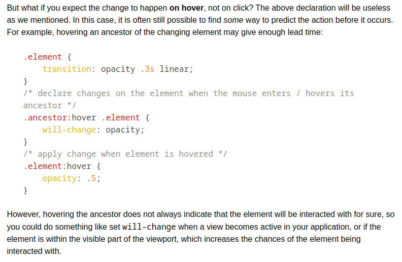
The will-change property allows you to inform the browser ahead of time of what kinds of changes you are likely to make to an element, so that it can set up the appropriate optimizations before they’re needed, therefore avoiding a non-trivial start-up cost which can have a negative effect on the responsiveness of a page. The elements can be changed and rendered faster, and the page will be able to update snappily, resulting in a smoother experience.
For example, when using CSS 3D Transforms on an element, the element and its contents might be promoted to a layer, as we mentioned earlier, before they are composited in (drawn onto the screen) later. However, setting up the element in a fresh layer is a relatively expensive operation, which can delay the start of a transform animation by a noticeable fraction of a second, causing that noticeable “flicker”.
In order to avoid this delay, you can inform the browser about the changes some time before they actually happen. That way, it will have some time to prepare for these changes, so that when these changes occur, the element’s layer will be ready and the transform animation can be performed and then the element can be rendered and the page updated in quickly.
Using will-change, hinting to the browser about an upcoming transformation can be as simple as adding this rule to the element that you’re expecting to be transformed:
will-change: transform;
You can also declare to the browser your intention to change an element’s scroll position (the element’s position in the visible scroll window and how much of it is visible within that window), its contents, or one or more of its CSS property values by specifying the name of the properties you’re expecting to change. If you expect or plan to change multiple values/aspects of an element, you can provide a list of comma-separated values. For example, if you’re expecting the element to be animated and moved (its position changed), you can declare that to the browser like so:
will-change: transform, opacity;
Specifying what exactly you want to change allows the browser to make better decisions about the optimizations that it needs to make for these particular changes. This is obviously a better way to achieve a speed boost without resorting to hacks and forcing the browser into layer creations that may or may not be necessary or useful.
repaint only happen in stacking context when less z index wala element is changed