Almost all elements can have the transform property applied to it, with the exceptions being <col>, <colgroup>, and non-replaced inline elements. “Non-replaced” simply refers to elements whose content is contained within the HTML document (<span>, <b>, and <em>, for example), as opposed to a “replaced” element’s content being contained outside of the document (<a>, <iframe>, and <img>, for example).
You do not need to memorize every element that is non-replaced, but rather keep this knowledge in mind should you try to apply the transform property to an element and aren’t sure why it isn’t working.
transform-origin : kis point se transform krna h
.rotated {
    transform-origin: 90% 90%;
    transform: rotate3d(1, -5, 1, -60deg);
2D Transforms
rotate
transform : rotate(45deg)scale
.element {
  transform: scaleX();
  transform: scaleY();
  transform: scale(x,y);
}
Skew : tedha krna like square to parallelogram
.element {
  transform: skewX();
  transform: skewY();
  transform: skew();
}
Translate : idhar udhar krna
.element {
  transform: translateX();
  transform: translateY();
  transform: translate();
}
We could chain multiple transform and the transformation happen from left to right
.red-box {
  background: red;
  transform: rotate(45deg) translate(200%);
}

.blue-box {
  background: blue;
  transform: translate(200%) rotate(45deg);
}
blue box and red box are at the same location but will be at different position after transform
3D Transform
perspective
https://css-tricks.com/how-css-perspective-works/
use prespective to enable 3d looking value is distance of z axis from which we view these
.element {
transform: perspective();
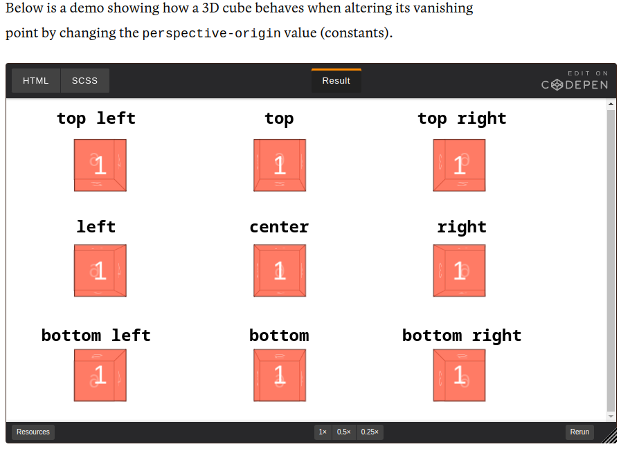
}perspective-origin : kidhar se dekh rhe
/**
 * Syntax
 * perspective-origin: x-position
 * perspective-origin: x-position y-position
 *
 * perspective-origin: <percentage> | <length> | constants | inherit
 */

.element1 { perspective-origin: 25% 75%; }

.element2 { perspective-origin: 10px 25px; }

.element3 { perspective-origin: left bottom; }
transform-style
.container{
transform-style:flat
}

`flat` (default)
`preserve-3d`
rotate
.element {
  transform: rotateX();
  transform: rotateY();
  transform: rotateZ();
  transform: rotate3d(x,y,z,a);
}
Scale
.element {
  transform: scaleZ();
  transform: scale3d(x,y,z);
}
Translate
These are the additional transform function values to translate an element on a 3D plane:
.element {
  transform: translateZ();
  transform: translate3d(x,y,z);
}
translateZ doesn’t do much without perspective. Instead, perspective and translateZ work together to create the illusion of 3-dimensional distance from the rendered object
Matrix
https://www.quackit.com/css/functions/css_matrix_function.cfm
.element {
  transform: matrix(a,b,c,d,e,f);
  transform: matrix3d(a1, b1, c1, d1, a2, b2, c2, d2, a3, b3, c3, d3, a4, b4, c4, d4);
}
Matrix is a way of combining all transform functions into one. It is seldom used due to its poor readability, and almost never written by hand. Unless you have a very complex transformation to apply, you should use other transform function values instead.
Matrix 2d

`a`, `d`

The arguments `a` and `d` represent how the element is scaled in the x and y direction respectively (just like in `scale(a, d)`).

`b`, `c`

The arguments `b` and `c` represent how the element is skewed (just like in `skew(b, c)`).

`e`, `f`

The arguments `e` and `f` represent how the element is translated in the x and y direction respectively (just like in `translate(e, f)`).


matrix 3d

Here's what they're for.

`a1`, `b1`, `c1`, `d1`, `a2`, `b2`, `c2`, `d2`, `a3`, `b3`, `c3`, `d3`, `d4`

These arguments are a number that describe the linear transformation.

`a4`, `b4`, `c4`

These arguments are a number that describe the translation to apply.
interesting about performance : https://developers.google.com/web/fundamentals/performance/rendering/#the_pixel_pipeline
The key benefit of using transform is that it occurs during composition. This makes it cheaper to use compared to many other CSS properties. You can see a table of what triggers are executed with each CSS property here.
tips and tricks : https://www.joshwcomeau.com/css/transforms/